BRANDING & IDENTITY
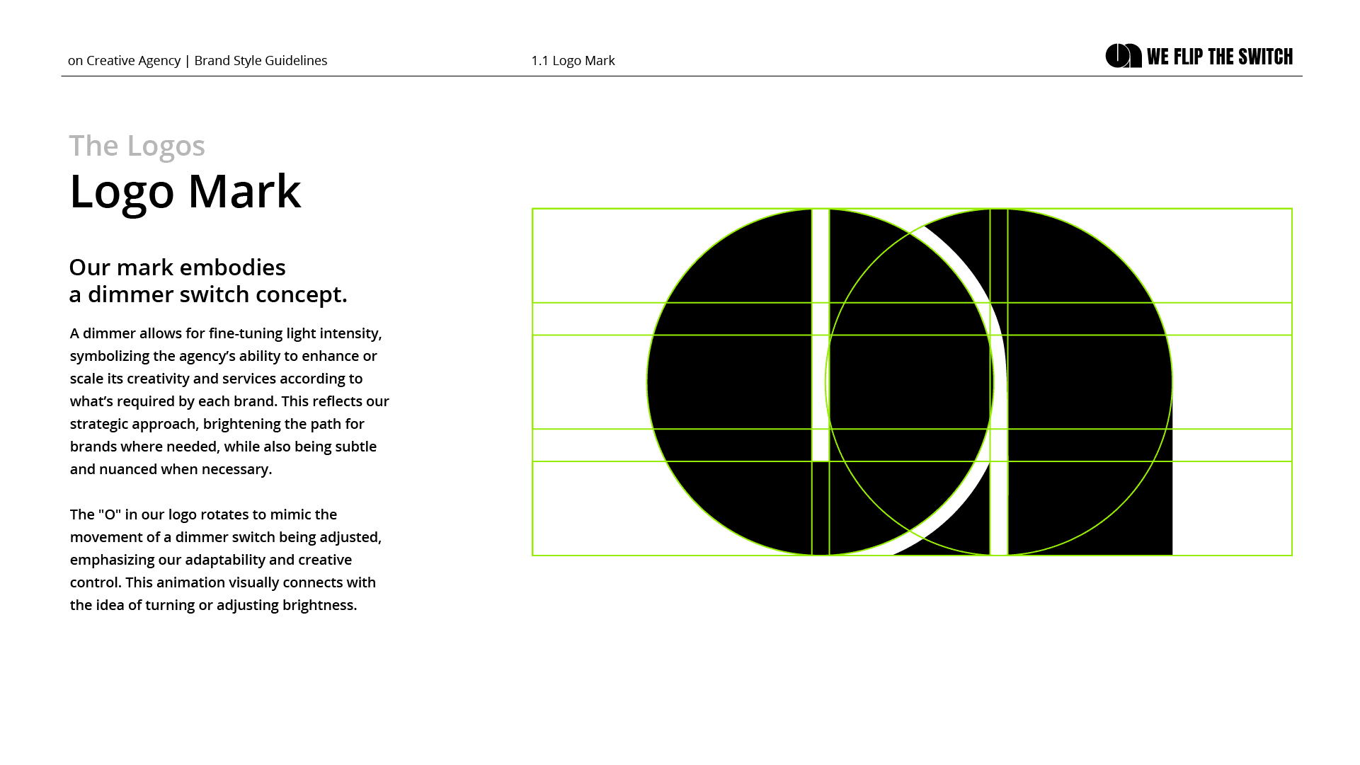
ON is a creative studio specializing in photography, content production, and visual storytelling. The identity was developed around a simple yet expressive idea: the act of turning something on. At the center of the system is the letter "O", reimagined as a dimmer control - a visual metaphor for light, intensity, mood, and creative direction. A subtle reference to the tools and environments that shape image-making, the symbol becomes both a functional element and the foundation of the brand's visual language.
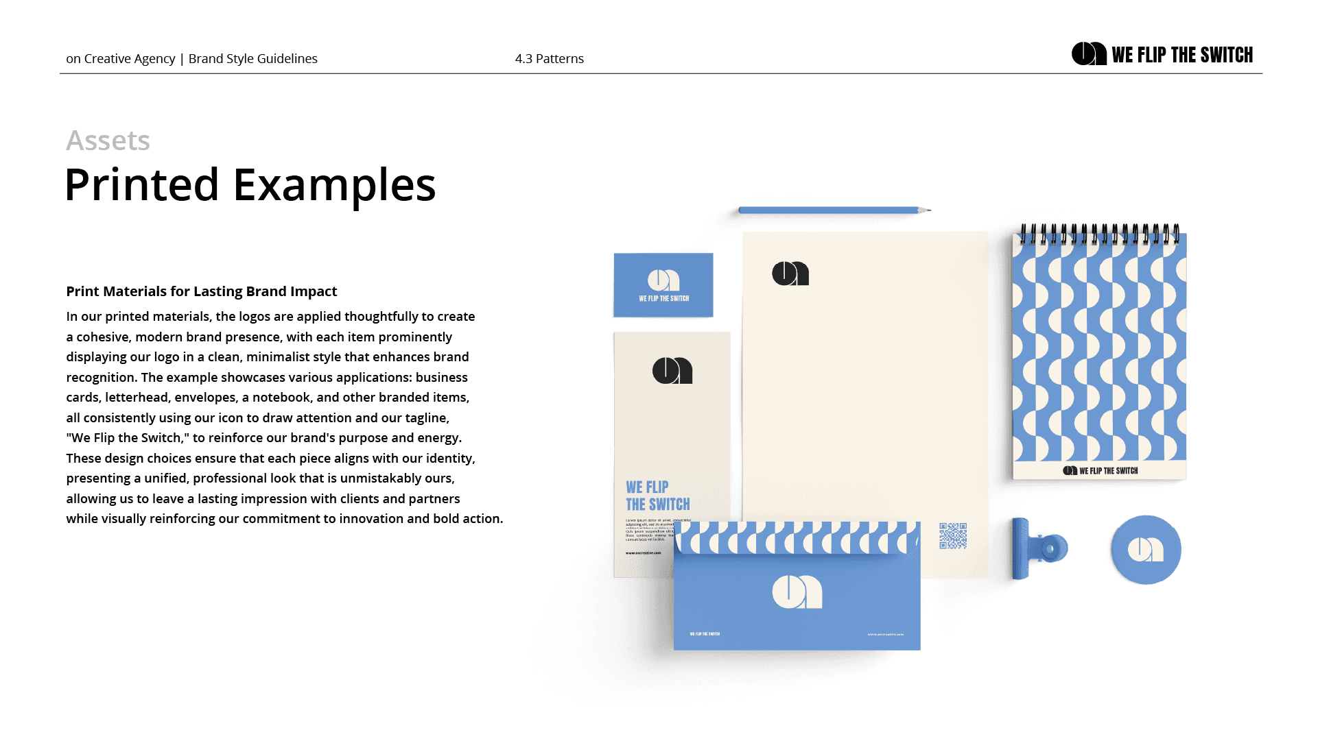
Scope: Brand Identity Design / Art Direction / Logo Design / Visual Identity / Brand Applications / Social Media Assets
Photography begins with light. The identity translates this principle into a graphic system built around control, adjustment, and activation. The circular "O" functions as a dimmer, representing the ability to increase or reduce intensity, shape atmosphere, and define perception. Much like a photographer controls exposure and a creative team shapes visual narratives, the symbol reflects the studio's role in directing how stories are seen and experienced. The result is an identity that communicates creativity through a simple interaction rather than a decorative gesture.